
AkzoNobel is a Dutch multinational company that creates and supplies innovative paints and performance coatings for consumers and industries worldwide.
Illustrations are central to AkzoNobel’s communications, turning complex ideas into clear, engaging visuals. As part of the brand refresh, I worked on redefining the illustration style so it could be applied consistently by both internal teams and external partners. The new style, built on geometric shapes and a structured grid inspired by core brand assets, creates a personal, flexible and distinctly AkzoNobel look. Supported by clear guidelines, it’s scalable, easy to reproduce and rich in brand personality.
A Brand Illustration refresh and a clear system everyone can follow
Task
Brand Illustration
Client / Cathegory
Akzo Nobel / Paint Company
Place
Amsterdam (NL)
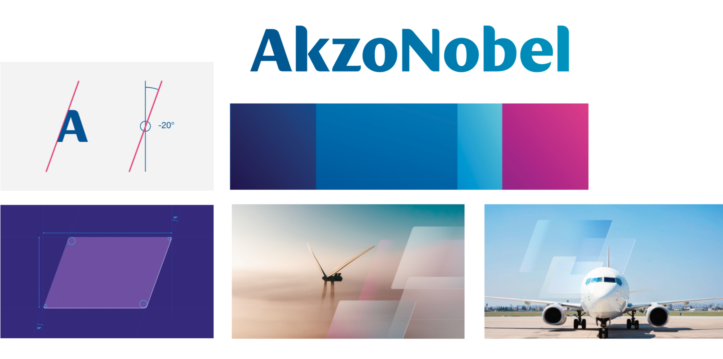
AkzoNobel’s core brand assets
Their slanted design element defines the overall look and is a key part of their corporate identity. Its shape conveys motion, agility and positive progress, showing that everything they do has direction and purpose. The shapes are tailored to their colour schemes, Blue, Purple, Violet and blended tones.
Concept
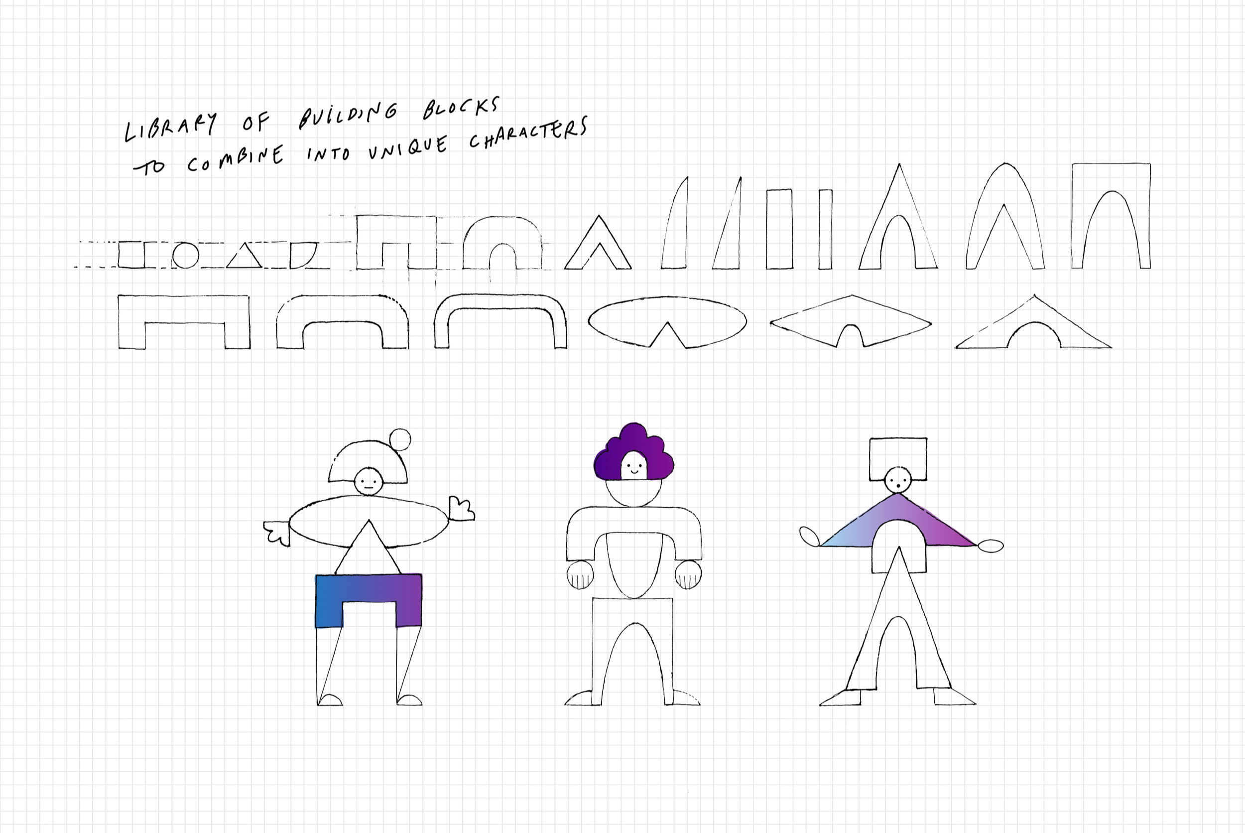
This project explores a system of reusable building blocks and clear guidelines designed to make it easy for anyone to create new illustrations.
(The visual style in the sketches below is still under development.)
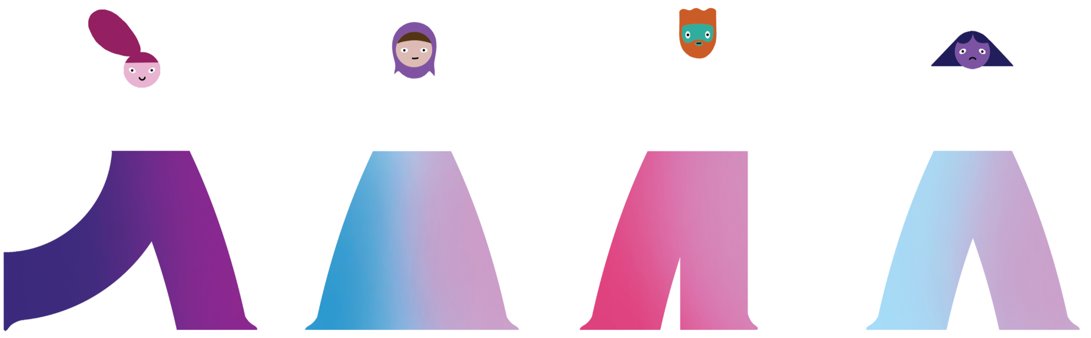
Head The various colours represent human diversity, including aspects like sexuality, ethnicity, gender, race etc.
Building blocks

Hair / Accessory The various colours represent human diversity, including aspects like sexuality, ethnicity, gender, race etc. The hair / accessory can be realistic or imaginary.

Legs The leg shape with its gradient, subtly references Akzo Nobel’s iconic slanted shape without directly copying it.
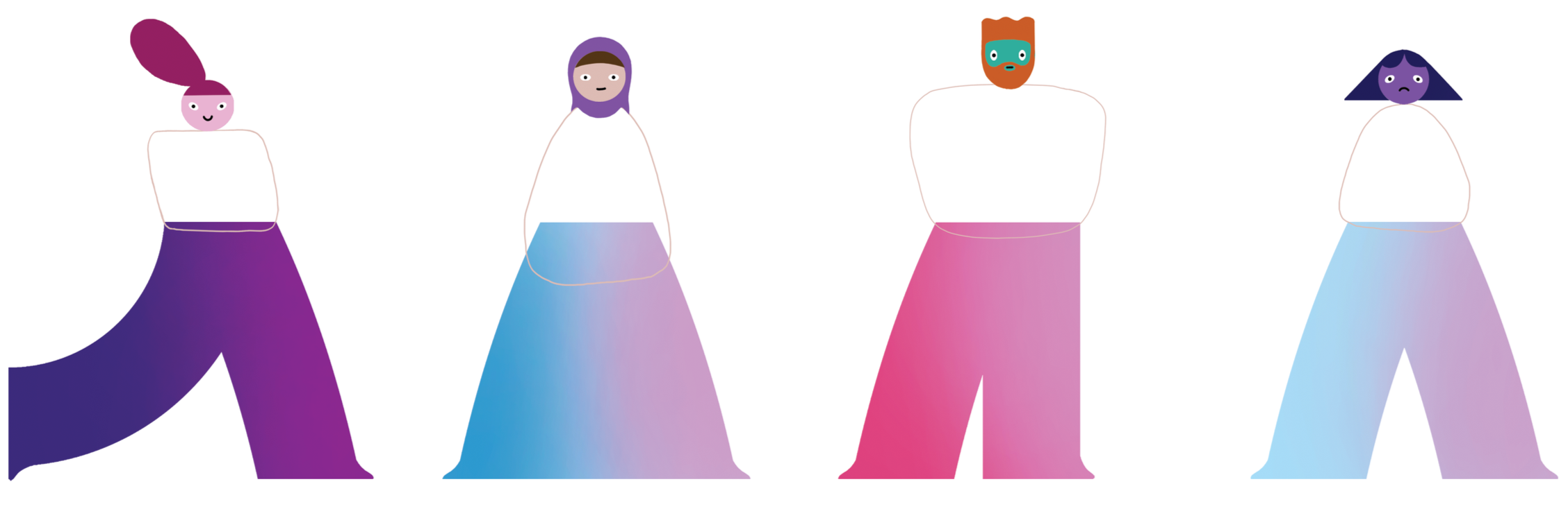
Torso The organic torso adds creativity, giving the characters individuality and movement.
Arms / Hands The arm is a single, nearly uniform curve in thickness. The hand matches the arm’s thickness and is angled to convey different expressions. The arms are ideally the same colour as the face but can be coloured differently for expressions requiring long sleeves (e.g. protective clothing).
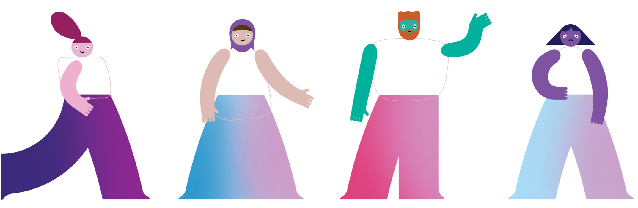
Clothing The torso is the main area for conveying a character’s clothing and overall style, with its shape defining the type of garment. Arms should match the face’s skin tone unless long sleeves or gloves are needed. Legs are typically colored with an Akzo Nobel gradient unless special footwear is required. Accessories may be added to enhance the design or communicate specific traits.
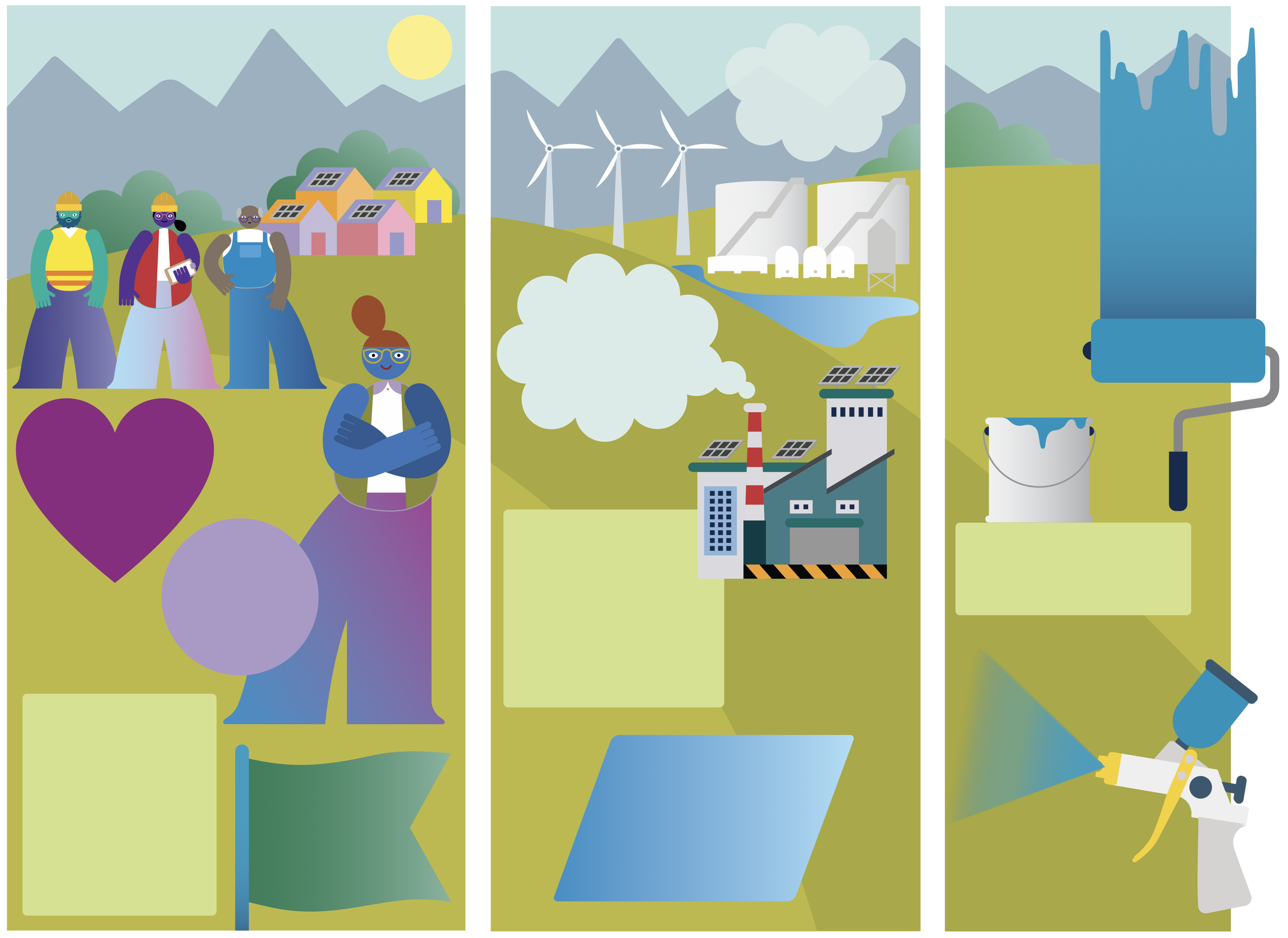
The Library
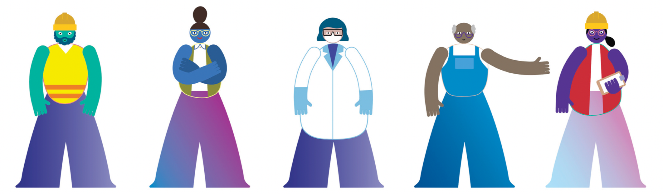
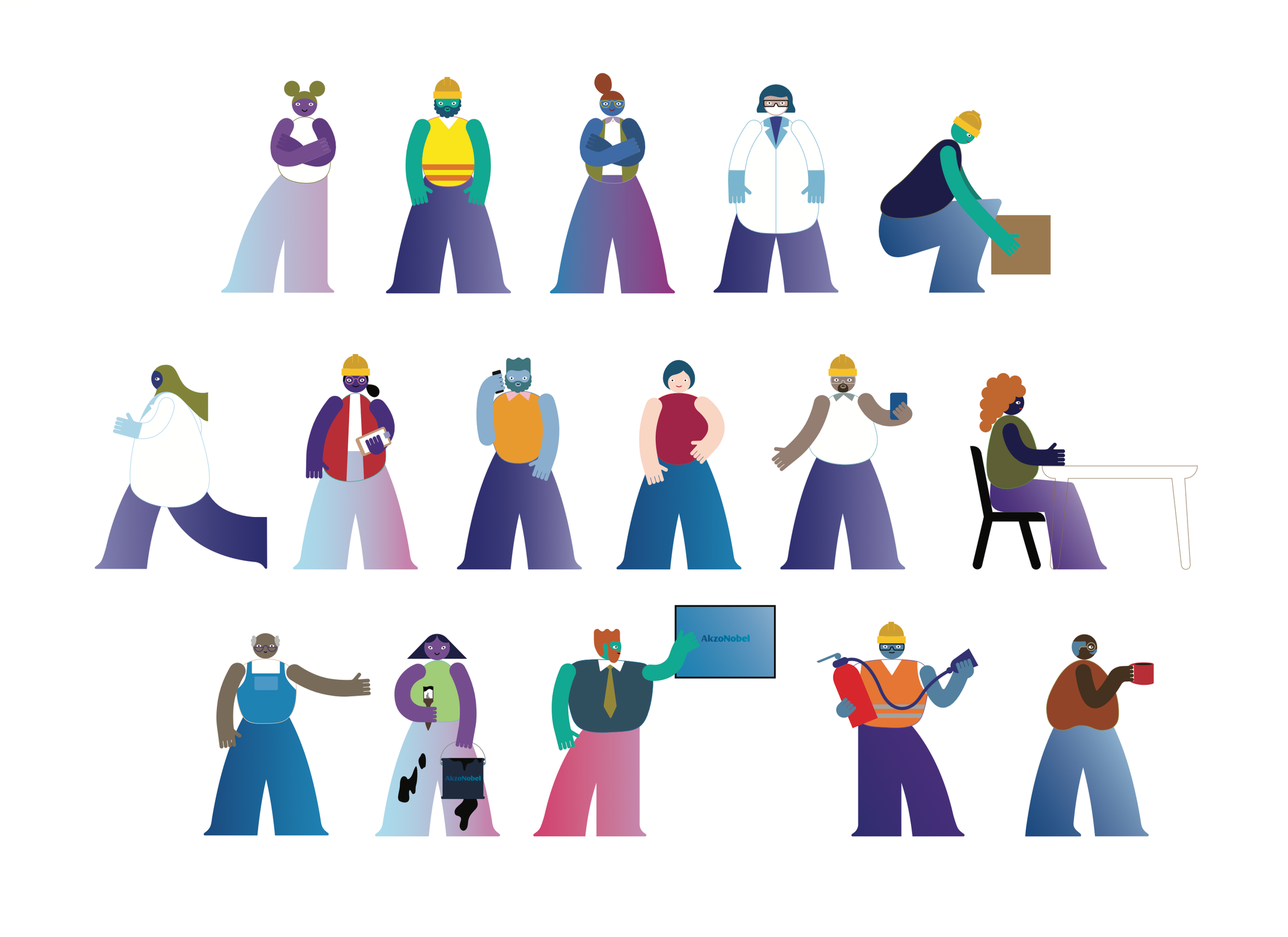
People

Interiors

Environment

Logistics
Example Illustrations
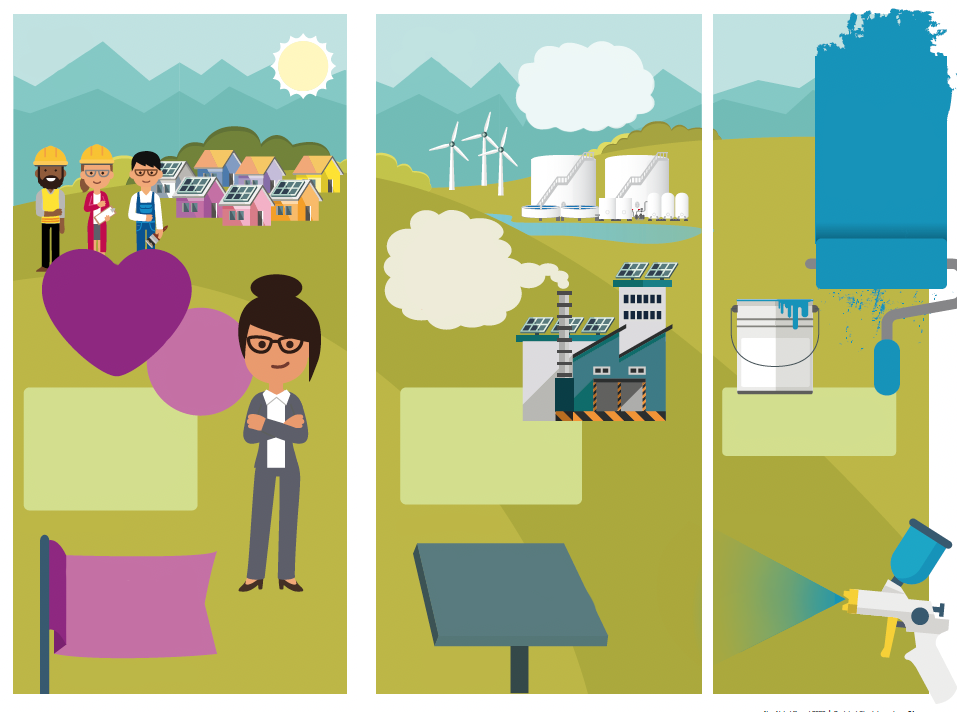
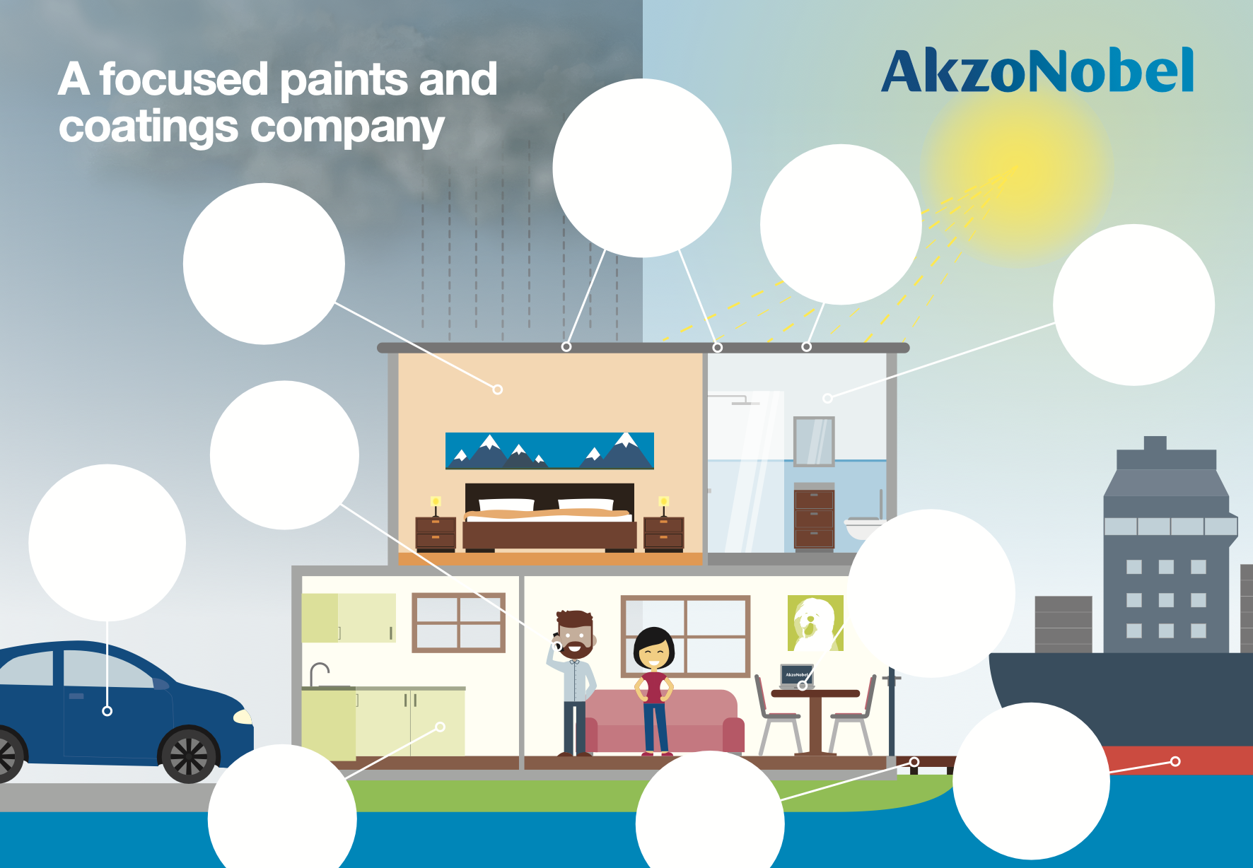
Before
After
Before
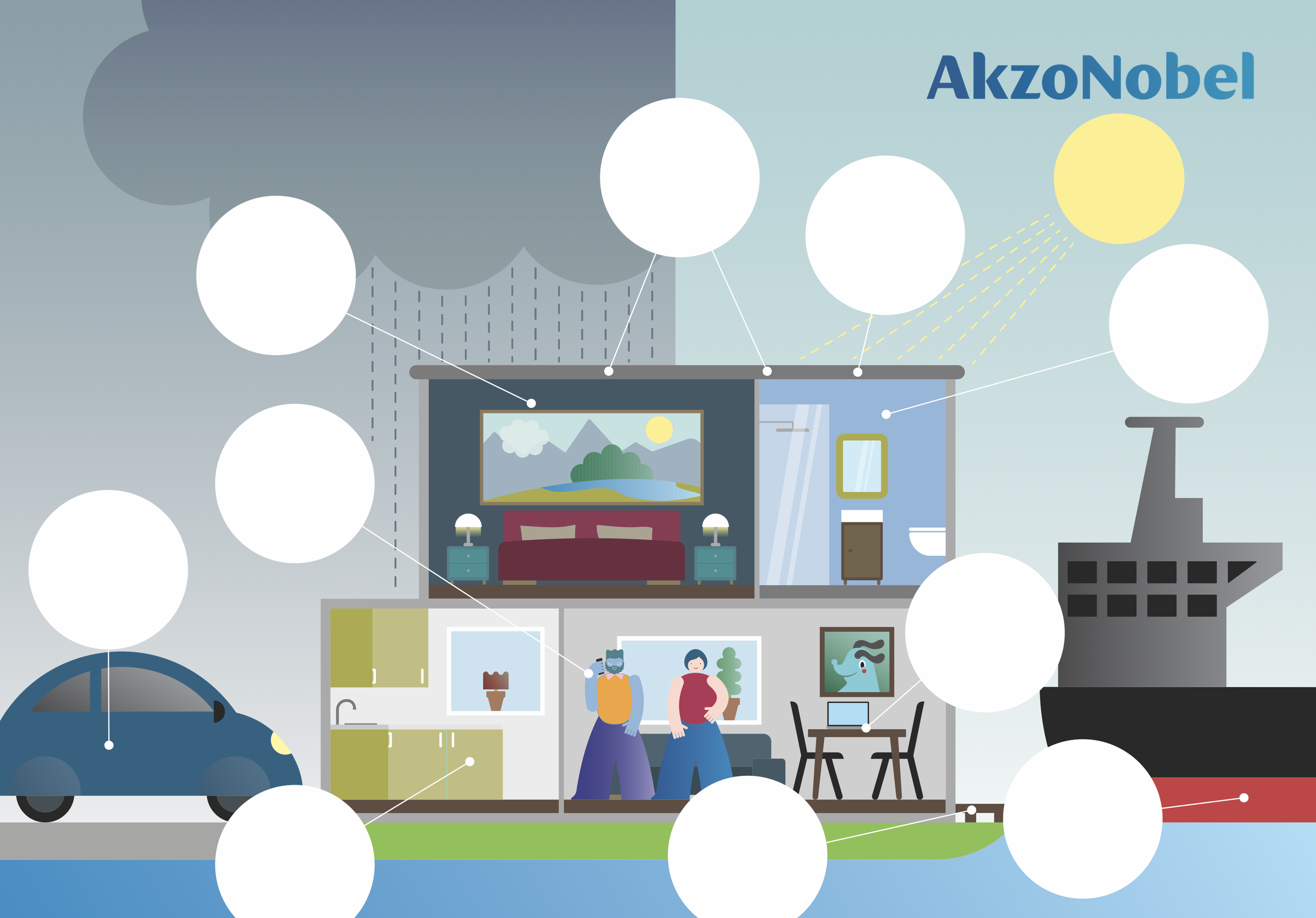
After

Before

After